Nutro Docs
Glassmorphism Components
Glassmorphism Components
Simple & intuitive glassmorphism components that can be used in your websites
Note:
All the below are
reactcomponentsIn your react projects, install the dependancies using npm (or) yarn
In case of npm
npm i nutro-componentsIn case of yarn
yarn add nutro-componentsGlassmorphism buttons
Some awesome glassmorphism buttons of different flavours that you can plug & play in your apps

| Prop | Value | Default |
|---|---|---|
| onClick | click action logic | - |
| size | normal, large, small | normal |
import { GlassButton } from "nutro-components";
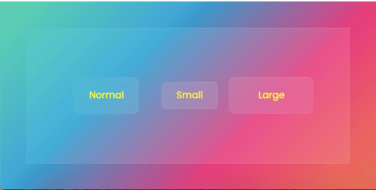
<GlassButton type="glass">Normal</GlassButton><GlassButton type="glass" size="small">Small</GlassButton><GlassButton type="glass" size="large" onClick={() => alert('button clicked')}>Large</GlassButton>Note:
Glassmorphism components looks better in bright gradient like backgrounds. To get the background just like the above one
import { GlassButton } from "nutro-components";
<div className="glassmorphism"> <div className="inner"> <GlassButton type="glass">Normal</GlassButton> <GlassButton type="glass" size="small"> Small </GlassButton> <GlassButton type="glass" size="large" onClick={() => alert("button clicked")} > Large </GlassButton> </div></div>;.glassmorphism { width: 10cm; height: 7cm; background: linear-gradient(-45deg, #ee7752, #e73c7e, #23a6d5, #23d5ab); display: flex; justify-content: center; align-items: center;}.inner { width: 8cm; height: 5cm; background-color: rgba(255, 255, 255, 0.1); border: 1px solid rgba(255, 255, 255, 0.1); display: flex; justify-content: center; align-items: center;}