Nutro Docs
Ecommerce Components
Ecommerce Components
Exclusive ready to use e-commerce components to power your business
Note:
All the below are
reactcomponentsIn your react projects, install the dependancies using npm (or) yarn
In case of npm
npm i nutro-componentsIn case of yarn
yarn add nutro-componentsQuantity control button
One of the most common component - quantity control button to add/remove items


import { QuantityButton } from "nutro-components";
<QuantityButton />;Switch/Toggle
Veg/Non veg toggle component


| Prop | description | type | Value | Default |
|---|---|---|---|---|
| state | active state of switch | boolean | false, true | false |
import { EcomToggle } from "nutro-components";
<EcomToggle />;Image magnifier
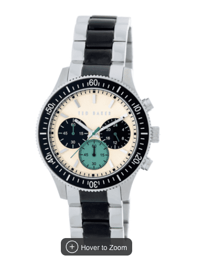
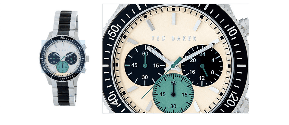
Zoom in images for preview
| Prop | description | type | Value | Default |
|---|---|---|---|---|
| images | pass 2 images of 687 & 1200px | array | - | - |
| isHintEnabled | show hint for users | boolean | true/false | false |
import { ImageMagnify } from "nutro-components";
// replace the path with your image folder pathsimport watchImg687 from './lib/components/Ecommerce/images/wristwatch_687.jpeg';import watchImg1200 from './lib/components/Ecommerce/images/wristwatch_1200.jpeg';
const images = [watchImg687, watchImg1200]
<ImageMagnify images={images} isHintEnabled={true} />Slider components
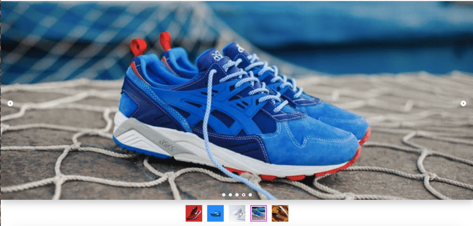
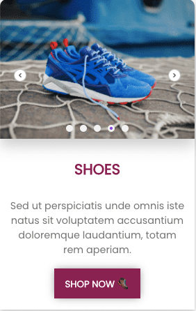
Product slider components - card slider, enlarged preview slider
| Prop | description | type | Value | Default |
|---|---|---|---|---|
| slideimages | pass list of images to be added to the slider | array | - | - |
| dot | show dots indicator | boolean | true/false | false |
| preview | show dots indicator | boolean | true/false | false |
| autoplay | autoplay timings in seconds | number | - | null |
| size | small/large slider | string | sm, lg | sm |
import { Slider } from "nutro-components";
// replace the path with your image folder paths/* slider related imports */import styles from './lib/components/Ecommerce/slider/slider.module.css'import Slider from './lib/components/Ecommerce/slider/ProductSlider'import ShoeOne from './lib/components/Ecommerce/slider/images/shoe1.jpg'import ShoeTwo from './lib/components/Ecommerce/slider/images/shoe2.jpg'import ShoeThree from './lib/components/Ecommerce/slider/images/shoe3.jpg'import ShoeFour from './lib/components/Ecommerce/slider/images/shoe4.jpg'import ShoeFive from './lib/components/Ecommerce/slider/images/shoe5.jpg'
// list of images for the sliderconst slideimages = [ShoeOne, ShoeTwo, ShoeThree, ShoeFour, ShoeFive]
//card slider section<div className = {styles.card}> <Slider size = "sm" slideimages = {slideimages} autoplay = {3} dot = {true} /> <div className = {styles.cardcontent}> <h4 className={styles.heading}>SHOES</h4> <p className = {styles.cardtext}>Sed ut perspiciatis unde omnis iste natus sit voluptatem accusantium doloremque laudantium, totam rem aperiam. </p> </div> <div className = {styles.footer}> <button>SHOP NOW 🥾</button> </div></div>
// enlarge preview slider section<div className = "big-slider"> <Slider size = "lg" slideimages = {slideimages} autoplay = {3} dot = {true} preview = {true}/> </div>Product Card
Product information card with pricing details & quantity button
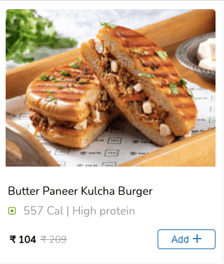
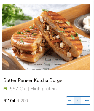

Note: The image enlarges with slight transition when hovered
Demo product object
const product = { image: BurgerImage, name: "Butter Paneer Kulcha Burger", isVeg: false, description: "557 Cal | High protein", actualPrice: "₹ 209", discountedPrice: "₹ 104",};import { ProductCard } from "nutro-components";
// replace the path with your image folder pathsimport BurgerImage from './lib/components/Ecommerce/images/burger.jpeg'
const product = { image: BurgerImage, name: 'Butter Paneer Kulcha Burger', isVeg: false, description: '557 Cal | High protein', actualPrice: '₹ 209', discountedPrice: '₹ 104'}
<ProductCard product={product} />